Data Visualization Showcase
As part of an internal event here at ThoughtWorks, I’ve been putting together various Big Data and Visualization related stuff. Some of it’s worth sharing outside ThoughtWorks, so I’ll post a few things here.
First up is a Visualization Showcase. Look at all this cool stuff you can do with data!
This image is a map of New York City, showing the geo-location of Flickr photographs and of Tweets. The Flickr photos are orange dots, the Tweets are blue dots. You can see that people are likely to photograph and tweet from different locations. Source: IBTimes Picture This – Daily Photo News
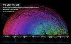
The next image is a representation of tweets between Twitter’s first 140 employees. Source: Connections among Twitter employees / Jason Stirman (stirman) on Twitter
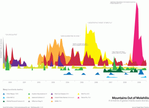
The next image shows media fear-mongering for various different scares, such as bird flu, SARS, and the Year 2000 Bug. What’s even more interesting are the patterns: there is a twice-yearly peak for scares about violent video games. Once in December (makes sense, lots of new games are coming out) and once in April. Why April? It’s the anniversary of the Columbine Massacre, and we see that event echo throughout the media each year. Source: Mountains Out of Molehills
Do women rule the Internet? The next visualization shows the female, or male, dominance of users on various websites. Source: Chicks Rule?
Are corporate fines for lawbreaking really punishing the corporations? A visualization of fines vs. annual revenue for major lawbreakers. Note that there are an awful lot of Big Pharma fines over the years. Source: Punytive Damages? World’s Biggest Corporate Fines
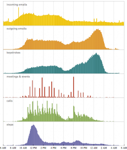
Stephen Wolfram has been quietly collecting every scrap of information he can about himself. He’s been recording every keystroke, phone call and email for over two decades. The result is an interesting set of personal analytics. Source: Stephen Wolfram Blog : The Personal Analytics of My Life
Videos
Visual.ly is a community for sharing and collaborating on visualizations. Their intro video is excellent. Source: http://visual.ly/
David McAndless’ TED talk on visualization. He contributes regularly to the Guardian Datablog and runs Information Is Beautiful.
David McCandless: Data is Beautiful
Hans Rosling’s visualization of the development of the world since the 1800s, showing how countries have moved from “poor and sick” to “rich and healthy” but that there is still much inequity.
Hans Roslin: 200 Countries, 200 Years in 4 Minutes
Websites
mike on October 16th 2012 in Agile


